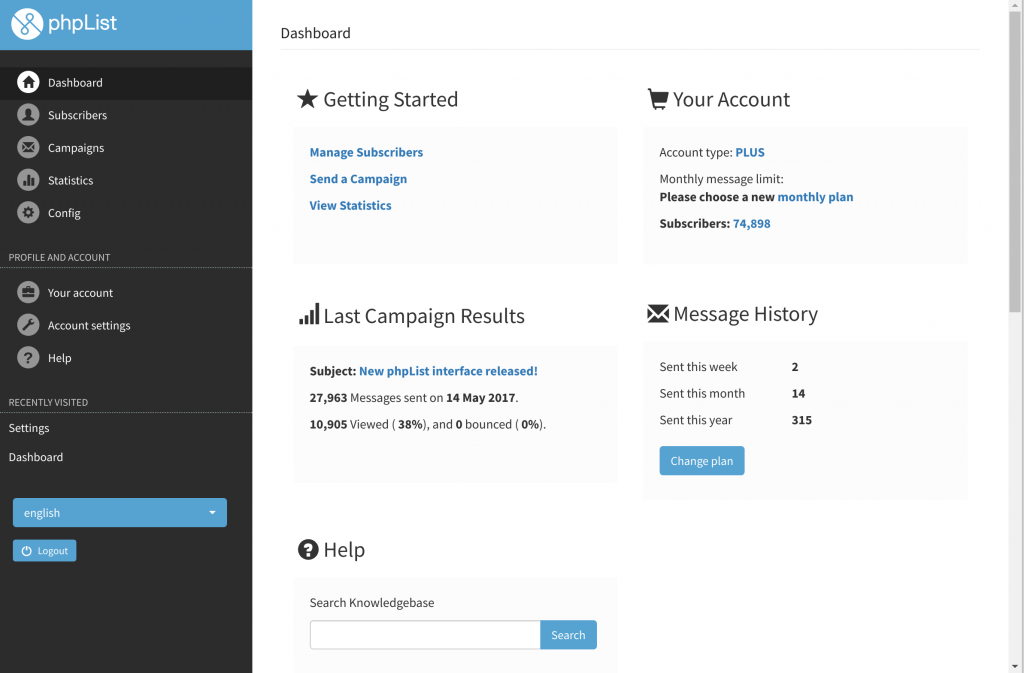
As mentioned in last month’s update, we’re getting closer to releasing a visual makeover of your phpList experience. This major development has been months in the making and involved a team of usability experts and designers. Here’s a walk-through to give you a sneak peek of what your workspace will soon look like. Keep in mind that some elements may still change as polishing of the design continues.
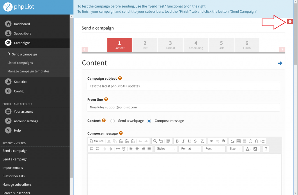
The first change you’ll notice is layout. Replacing the top-down menu list at the top of the screen is a new sidebar containing all account and application locations. Campaigns and Billing information are now accessed from the same place, and more screen space is available on laptop, desktop, and tablet screens for getting things done. The sidebar is automatically replaced with a touch-friendly menu on mobile devices and smaller screens.

Contextual help now drops down from the top of the page when an information button is clicked. Look out for these small red buttons whenever you’re unsure.

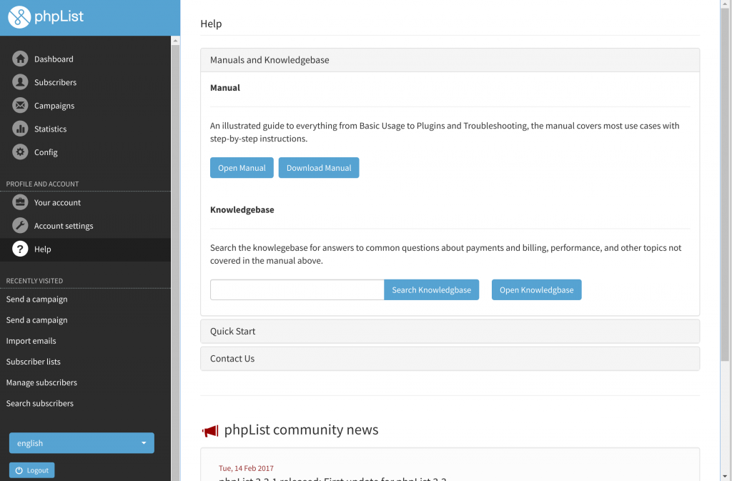
Speaking of help, there’s a whole new knowlegebase and integrated help section where articles on everything from billing to blacklisting can be found. You can also access the knowlegebase directly from your new account dashboard. Customer support remains a few clicks away when you need it, via the contact form. Getting the help you need has never been easier.

We’re in the process of preparing a limited rollout with a small group of early adopters. If you’d like to participate, space is still available. Join the programme here!
Once we’re confident that the new design is the best it can be it will be made available for all customers. We believe that this redesign will help you get the most out of your account and quickly get to work on what matters with your email marketing.
