Big news! The long awaited overhaul of phpList’s interface is now being deployed to hosted accounts. As the most requested improvement by phpList customers, we’re delighted to be delivering what people want this holiday season. Here’s a run down of the standout improvements.
Dapper dashboard
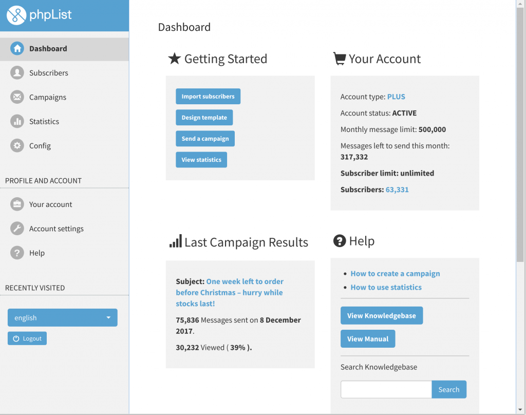
The redesigned dashboard conveniently summarises your account status and campaign statistics, as well as connecting you directly to the recently launched phpList knowledgebase. Query articles on templates, sub-accounts, and spam-traps with a single click of the Search button. Learn more about the knowledgebase in this blog post.
Multiform menu
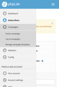
Functionality is now easier to find and navigate thanks to a redesigned side-bar based menu. Here you’ll find all the same familiar options organized into a single column (click or tap to expand sub-menus when needed). Click the compacted icon top right of the screen on small screens to roll the menu down.
Amalgamated account pages
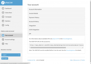
Billing, credit consumption, API, and integration details can now all be found within the unified My Account page. Account Settings and Help are similarly consolidated, with new options for managing sub-accounts, and integration of additional help resources such as popular topics in the phpList manual. All three are members of the main app navigation.
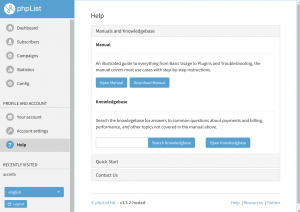
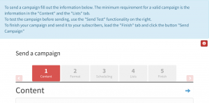
Usage advice for the page currently viewed is now accessible via red Info buttons top right of most pages, putting contextual tips within easy reach.
Marvelous on mobile
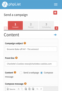
The new responsive layout includes large, finger-friendly buttons, self-rearranging tables, and more efficient use of space (squeezing more on to small screens). Design is responsive and makes accessing your account on mobile much easier.
User Experience designer Piet Kruithof led the Account page redesign work, bringing 20 years of experience at firms including Hewlett Packard, Intel, and The OpenStack Foundation. Multiple rounds of testing and feedback from the Early Adopters Club and other phpList customers were crucial to the development process.
As you explore the changes, we encourage you to share your feedback with us: your input shapes the next changes!
